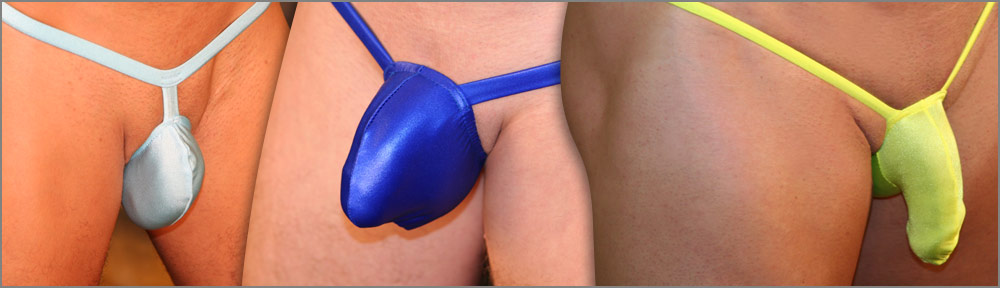
What I want you to look at is a fully operational web site that we just added to the koalaswim.com family. It offers most of the same products as koalaswim.com but with a different way of viewing the suits. I would love to hear feedback from as many as possible. This is a sister site to koalaswim.com and both sites will offer Koala products and both will be updated at the same time. We have added this site for people who want another option of how they can view the Koala collection. The Mens Swimwear Store offers all the swimwear designs but does not have most of the fetish styles that are listed on koalaswim.com. If The Men’s Swimwear store ends up being an option Koala customers like we will most likely add the fetish spandex designs too. I look forward to your feedback. It is not fancy but it is very functional.
Thanks
Michael David
15 thoughts on “Please take a look at this men’s swimwear site”
Comments are closed.
Nice looking site, although simple, as you stated; i already have some improvement suggestions, if you don’t mind: Order the suits in the site showing the newest collections first (or have the ability to select if on the site – list by name, by price, newer items first); Show more pictures of the suits (some have only 3 and we need more angles in several of the suits shown)
M.D. I looked at the website that u sent us with the link and I can only see that there may only be a cpl of things that koalaswim doesn’t carry? thx the for the link, but I will stick to buying from koala.
Hi Michael!
I’ve been a big admirer of your work for quite some time now, and I’m really happy that you’re considering a new page layout. This will certainly make finding the designs we want less of a hassle.
I do have one big suggestion, which I think will enhance the user’s experience when browsing through your designs.
I believe that having your designs put into different pages based on categories is going to go a long way in helping customers find what they’re looking for more quickly. You could separate the designs by back (bikini, thong, g-string, etc), or by pouch design (cock display suit, small pouch, MtF transformation pouch, etc). The best part is, these categories can overlap, so if I were, say, looking for the Ballistic Package G-String (http://www.themensswimwearstore.com/Ballistic-Package-G-string-BP9929.htm) I could find it in either/both the g-string and the cock-display sections.
Furthermore, you can have big categories and small categories. The big categories can be Regular Suits, Fetish Suits, Chastity/Toys, DVDs, etc. And then the small ones can be the ones I mentioned before.
This webpage is a great example of what I mean: https://bodyaware.com/gallery/view/underwear/tangas It has all the “big” categories at the top, and they all have their “small” categories to the left.
Another suggestion is to allow users to “sort” the designs by price or by date. This will help customers easily find out which designs are newer and which ones are less expensive and will fit their budget better.
I hope these suggestions make sense to you and that you consider using them for your webpage, as it will make it so much more user-friendly and accessible.
Thank you so much for your time,
KD
Will give that some thought. I printed out your post I will spend some time with it.
MD
i much prefer the new website!
I think it was time to change the look of the Koalaswim web store. This new site looks great. With a couple of tweeks here and there it could be perfect and replace completely the koalaswim web site (not just the store)!
I think we will keep both sites up!
MD
Wow, that is a great site design! I like how we don’t have to click a lot to see all the designs. It looks much more modern 🙂
One suggestion: since your suits have such great back designs, could you add (optionally?) a thumbnail of the back of each suit next to the main thumbnail?
Did you click on the photos. We have the backs on most of them listed.
MD
I loved the new site! Scrolling down I could see and compare the whole range and pause and look more closely at the suits that most interested me. I felt it was much more buyer-friendly.
I much prefer your new site. I never cared much for the old site since it took too long to view all the suits and even longer to find a certain suit. Also, one could not go back through the screens, only forward. I would like to see all of your fine products in the new site. That is my humble opinion.
The New site looks good plan and Simple easy to use… I think it may be a hit.. 🙂
I REALLY like this new website presentation. It’s laid-out like other website catalogs (conventional). It’s so user-friendly, I went through every item listed. That’s
what you want, right?
Thanks!!!
MD
I like this website; keep it.
When will you release the short shorts?
Most likely in Sept.
MD
Love the look and simplicity of the site i do agree that it should have the option of how it is sorted. other than that i just love looking at them. They turn me on so much i could ejaculate. I cant wait to buy many of the garments. Also more photos of the suits would be great. Maybe even some from customers.
I meant rather on that initial list of all the suits, so at a glance (without having to click) we can see what the backs look like. I am particular to fetishy/strappy backs. 🙂
I agree that it would be great to have the ability to search designs by keywords, even combinations of keywords, like “red” + “g-string”
I’m going to concur with everything KD said. I love koala and really hope you move everything over to the new format.
My only additional suggestion, though this would be a huge pain for you, would be to rephotograph all the suits so that there is a standard set of at least 4 poses/angles/close ups for every suit. That makes it MUCH easier to compare suits when you can compare apples to apples (or bulge to bulge). (Mensunderwearstore.com does a great job of this)
It would also be great if when you click the thumbnails, the pop-up pictures were bigger than they are.
You know you have loyal customers who will buy your stuff no matter what the web page looks like. But it sure would be nice if the whole thing was more in-line with other retail websites.
That’s my 2 cents!
Thanks for taking a look. I will look into the close up features.
MD